








Solid, Tricolor, Ring or Pattern: Colored Contact Designs Explained
Same color, wildly different result — the pattern is why. What solid, tricolor, limbal-ring and special-effect designs each do on your eye, and which to pick for your goal.
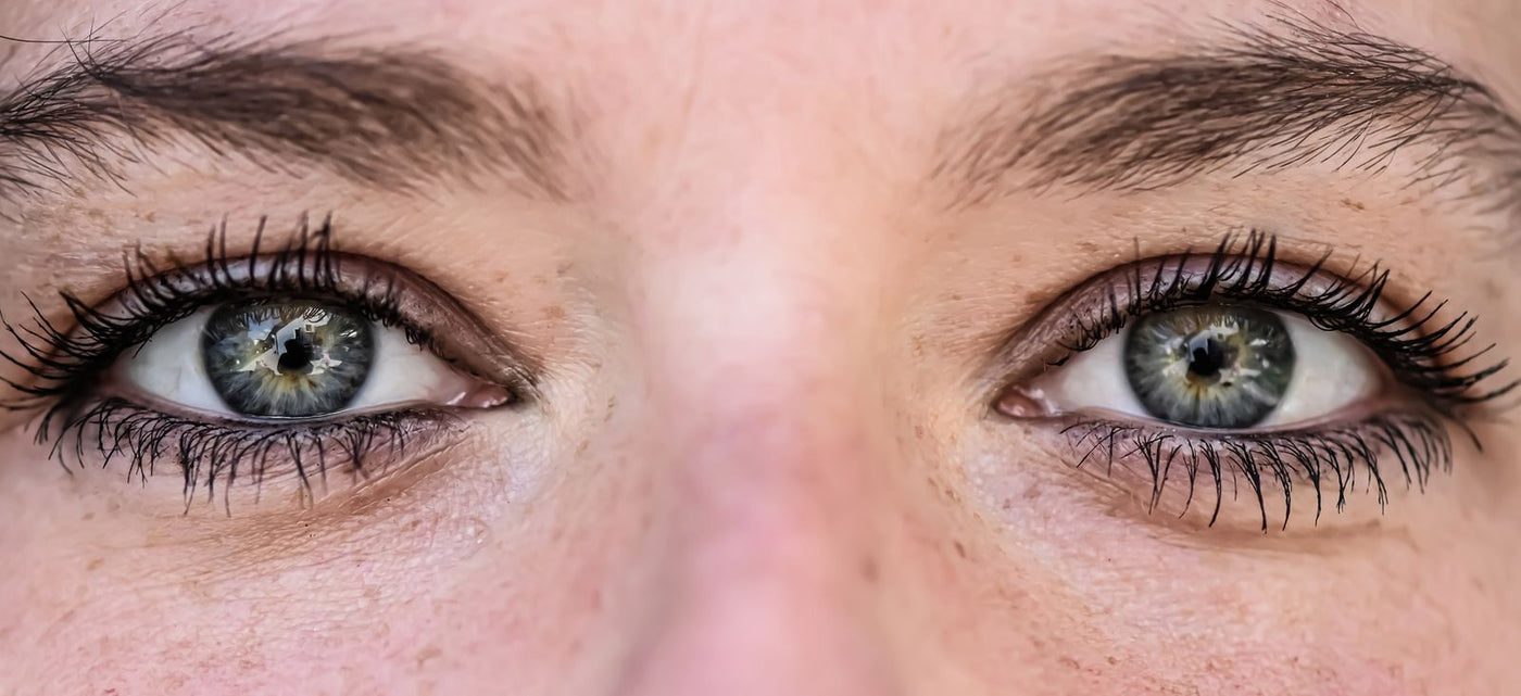
Put two "gray" lenses side by side and one reads as a natural light eye while the other looks like a flat sticker. The color is identical; the pattern isn't. Design is the most under-explained part of buying colored contacts, so here's the whole vocabulary — what each structure does on the eye, and which one matches your goal.
Solid opaque: maximum coverage, minimum texture
One dense, even layer of color that covers the iris underneath instead of blending with it — a true flat solid like Violet Block. Natural shades rarely go fully flat; the closest everyday hazel is the Pure Hazel below, which still carries some tonal variation. Pros: total coverage on any base color, the truest match to the vial shade, usually the cheapest to make well. Cons: real irises aren't uniform, so solids are the most likely to read as "wearing contacts" up close in daylight. Best for: camera work (flat color photographs cleanly), costume bases, and anyone who prioritizes color accuracy over stealth. The believability mechanics are unpacked in why contacts look fake.

Tricolor and gradient: the natural-eye impersonators
Two to three tones blended radially — dark rim, mid-tone body, lighter or warmer burst around the pupil, like a DNA Taylor Green. This mimics how real irises scatter light, which is why tricolors dominate the "is she wearing lenses or is she just gorgeous" category. Pros: depth, believability, flattering in person and on camera. Cons: the final color mixes with your base iris more than a solid does — expect the result to lean warmer/darker on deep brown eyes (the mixing rules live in the dark eyes guide).

Limbal ring designs: the enlarging illusion
A deliberately dark, defined outer ring — the feature that made circle lenses famous (full history in circle lenses vs colored contacts). Babies and anime characters have strong limbal rings; adult rings fade with age, so a crisp ring reads as youth and makes the iris look bigger without any extra millimeters of plastic. Best for: smaller eyes chasing the doe-eye effect at a sane diameter (see the small eyes sizing guide). Watch out: a very thick black ring on a very light lens is the classic 2010 circle-lens look — charming as a deliberate aesthetic, dated as an accident.
Special patterns: cat-eye, block, mesh and friends
Where lenses stop impersonating eyes and start being props: vertical-slit cat and snake pupils, geometric block designs, vision-fogging mesh, spirals, symbols. These are costume hardware — judged on impact per meter, not believability. Two practical notes: patterned lenses have smaller clear zones, so expect edge-of-vision awareness in dim light (explained in the blur guide), and heavy patterns crop badly on hooded lids, where the design's upper third disappears.

The same logic covers multi-color designs — segment wheels and concentric rings that cycle several hues inside one iris. They are judged the same way as any prop lens: impact per meter, not believability. The rainbow contacts guide breaks down wheel versus feathered multi-tone, and the full lineup lives in the rainbow contacts collection.
Matching pattern to purpose, in one line each
Pass as natural → tricolor. Look younger/bigger-eyed → limbal ring. Photograph a specific color accurately → solid. Terrify or delight → special pattern. Cosplay a character → whatever the character has, which the character table has already decided for you.
Matching pattern to face distance — the tell nobody mentions
One thing pattern guides skip: the right design depends on how close people get to your eyes in the situations you'll wear them. At conversation distance (a foot or two — dates, meetings, coffee), fine iris texture reads and hard rings betray you, so tricolor and soft-rim designs win. At stage or content distance (photos, performance, video), that fine texture disappears and you need bolder contrast to register at all — a solid or defined-ring lens that would look fake up close reads perfectly on camera. At costume distance (a crowded con floor, a party), maximum pattern impact matters and subtlety is wasted. This is why a lens that looks amazing in your selfie can look flat in person, or vice versa: you matched the pattern to the wrong distance. Before buying, picture where your eyes will actually be seen from, and choose the design for that distance — soft and textured for close, bold and high-contrast for far.
FAQ
Why do two lenses of the same color look so different?
Pattern structure: solid layers show one flat tone, tricolors blend with your iris for depth, rings add contrast at the edge. Color names describe pigment; patterns decide the outcome.
Which pattern looks most natural?
Tricolor/gradient designs with a soft (not black) rim — they replicate the radial texture real irises have. Solids are the least natural up close, patterns aren't trying.
What is a limbal ring and do I want one?
The dark circle where iris meets white. Defined ring = younger, bigger-looking eyes; softer ring = more mature, subtler look. If you want enlargement without size, ring designs are the tool.
Do special patterns like cat-eye affect vision?
The pupil area stays clear, but smaller clear zones mean more edge awareness, especially at night when your pupil dilates past the clear zone. Fine for events; not for driving.
Which contact lens pattern is most natural?
Tricolor and gradient designs with a soft (non-black) rim — they replicate the radial way real irises scatter light. Solid opaque lenses are the least natural up close; special patterns (cat-eye, block, mesh) aren't trying to be natural at all.
What's the difference between a solid and a tricolor lens?
A solid lays down one even block of color — truest to the vial shade, best for camera and costume, but flattest up close. A tricolor blends two to three tones radially to mimic a real iris, giving depth and believability at conversation distance. Solid for accuracy, tricolor for realism.
You might also like
Picked to match this guide — every pair in stock now.
 Vika Tricolor Blue Colored Contact Lenses$21.98per pair (2 lenses)
 Polar Lights Blue Gray Prescription Colored $19.98per pair (2 lenses)
 Starry sky Gray Prescription Colored Contact$22.98per pair (2 lenses)
 Polar Lights Brown Prescription Colored Cont$21.98per pair (2 lenses)
Explore more: Colored Contacts for Dark Eyes →


