







Pink and Purple Contacts: Fashion Colors Without the Costume Vibes
Pink and purple lenses have two futures: editorial or costume — the pattern and the styling decide. How to wear fashion colors like fashion.
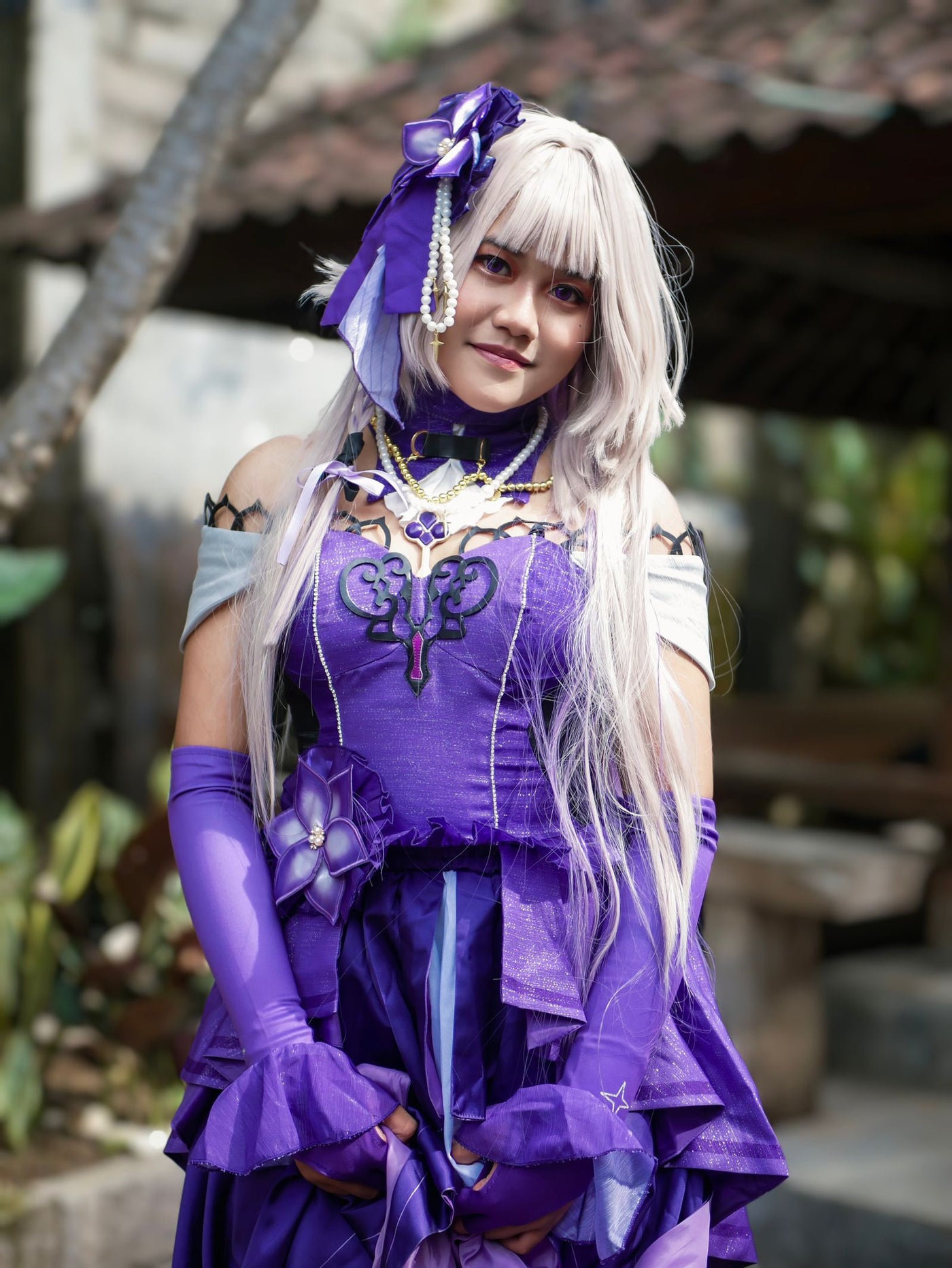
Pink and purple are the fastest-growing lens colors on this site and the most misunderstood: half the buyers want K-pop editorial, half want anime cosplay, and the same lens can't do both jobs. The pattern decides which side of the line you land on — and the styling seals it. Here's the map.
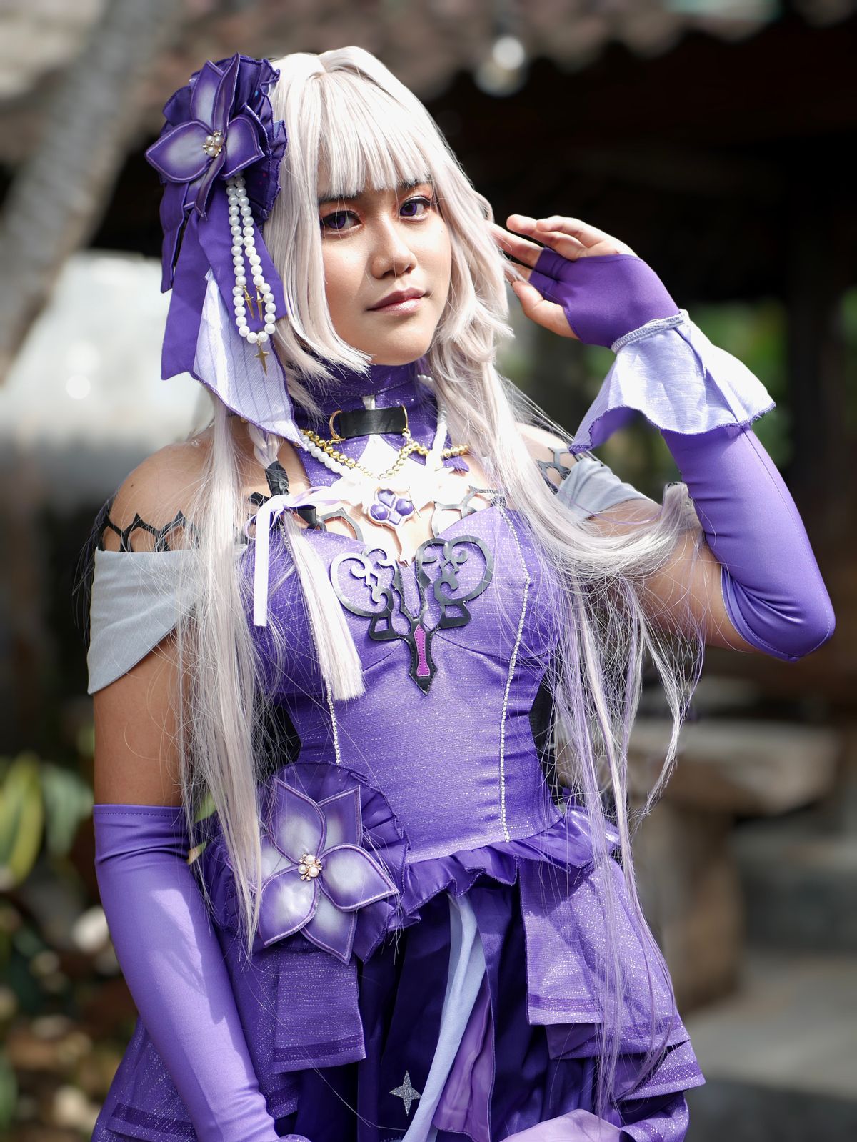
The line between fashion and costume
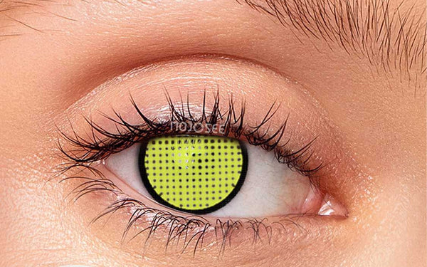
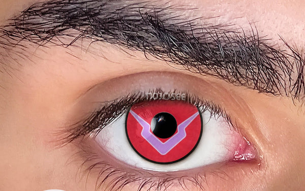
Three design variables draw it. Saturation: dusty rose and smoky violet read fashion; neon magenta and electric grape read costume. Texture: radial iris texture keeps unnatural colors anchored to a human eye; flat color floats free of it. Rim: a soft dark rim reads editorial; no rim reads anime deliberately. None of these are mistakes — costume is a valid destination — but you should arrive there on purpose.
Wearing purple like fashion
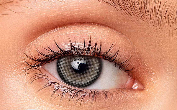
Violet is genuinely wearable because it sits close to real eye colors — deep blues and cool grays already flirt with it. The editorial picks: gray-violet blends like Gray Violet, where the purple reveals itself in daylight and reads as "unusual gray" indoors. The anime picks: saturated true violets like Powdery Violet — gorgeous, and unambiguous about what they are. Styling that keeps violet chic: cool metals, monochrome or black wardrobe, minimal warm makeup — violet collapses fastest next to orange bronzer. The one-hero rule from outfit styling is non-negotiable here.

Wearing pink like fashion
Pink is harder — no human has pink irises, so every pink lens is a statement; the question is which statement. Soft pinks like Kitty Pink with the blush-monochrome makeup formula (Look 4) land as soft e-girl / K-beauty editorial. Saturated pinks like Powdery Violet Block and friends belong to character work — Nezuko energy, deliberately. The styling rule: pink lenses demand the rest of the face agree — pink-toned blush and lip, zero heavy contour. Pink eyes over a full glam bronze face is the exact combination that reads "contacts" instead of "concept."

Who these colors flatter (everyone, differently)
Cool and deep skin tones wear violet spectacularly — the contrast reads intentional and expensive (more in the dark skin guide). Warm tones should lean pink-mauve rather than blue-violet. Black hair owns both colors; blonde + violet is a deliberate fashion flex; and for men, smoky gray-violet with monochrome streetwear is criminally underused — the same accessory logic as any statement piece in the men's guide.
Where to wear them
Realistic deployment: shoots and content days (both colors photograph beautifully — one step bolder survives the camera), concerts and festivals, fashion-forward evenings. Not the office, and that's fine — these are your second lens, not your daily driver. Cosplaying a specific character instead? The character table matches exact pinks and purples to names.
The saturation dial: where fashion ends and costume begins
The line between "editorial" and "cosplay" for pink and purple isn't the color — it's the saturation, and you can learn to read it before you buy. Picture a dial from muted to neon. The fashion zone (low-to-mid saturation): dusty rose, mauve, smoky lilac, grey-violet — these sit near colors that exist in nature and jewelry, so they read as an intentional style choice. The costume zone (high saturation): neon magenta, electric grape, candy pink — gorgeous, unmistakably a character look, zero attempt at subtlety. Neither is wrong; the mistake is buying a costume-zone color expecting a fashion result. Two more dials stack on top: texture (radial iris texture keeps even a saturated color anchored to a human eye; flat color floats free into costume) and rim (soft graduated rim reads fashion, hard ring reads anime). Read all three dials on a product photo — saturation, texture, rim — and you'll know exactly which side of the line a lens lands on before it arrives, instead of being surprised.
FAQ
Do purple contacts look natural?
Gray-violet blends pass as "unusual light eyes" in most lighting; true saturated violet never claims to be natural — it claims to be fashion, which is different and equally valid.
Can I wear pink contacts without looking like cosplay?
Yes: soft dusty pink, monochrome pink makeup, zero contour, minimal outfit. The costume read comes from saturated pink + full glam + no styling agreement, not from the color itself.
Which skin tones suit purple contacts best?
Cool and neutral undertones wear blue-violets; warm undertones should shift toward mauve and pink-violet. On deep skin, violet is one of the most striking combinations available.
Are pink and purple contacts available with prescription?
Many standard-diameter styles carry minus powers — check each product's power selector. Heavy anime patterns are more often plano-only.
Can I wear pink or purple contacts without looking like cosplay?
Yes — stay in the low-to-mid saturation zone (dusty rose, mauve, grey-violet), choose textured over flat designs, keep the rim soft, and pair with monochrome or minimal makeup. The costume read comes from high saturation plus flat color plus full glam, not from the color family itself.
Do purple contacts look natural?
Grey-violet blends pass as "unusual light eyes" in most lighting; true saturated violet never claims to be natural — it's fashion, which is a valid and different goal. If you want believable, choose the greyer, softer violets.
You might also like
Picked to match this guide — every pair in stock now.
 Enchanted Pink Colored Contact Lenses$19.98per pair (2 lenses)
 Vika Tricolor Violet Colored Contact Lenses$18.98per pair (2 lenses)
 Violet Mirage Colored Contact Lenses$22.98per pair (2 lenses)
 Kitagawa Pink Colored Contact Lenses$28.98per pair (2 lenses)
Explore more: cos-Pink → · cos-Purple → · Pink control →