







FreshLook ColorBlends Discontinued: The Closest Match for Every Shade
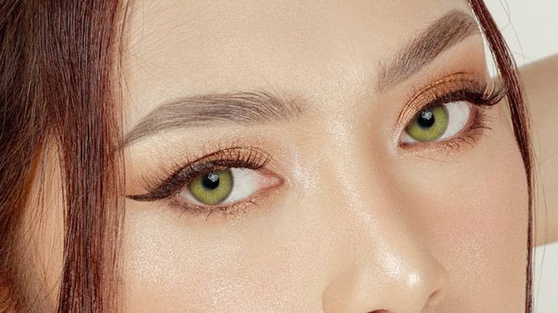
FreshLook ColorBlends is being phased out, and if you've worn Sterling Gray or Pure Hazel for years, the discontinuation feels personal — those shades were many people's "my color." The good news: what made ColorBlends work was never a secret formula. It was three-tone printing in natural sizing, and that recipe is very much alive. Here's how to match your old shade, tone for tone.
Start with the FreshLook shade you used:
- Sterling Gray: compare DNA Taylor Blue Gray.
- Pure Hazel or Honey: compare Pure Hazel.
- Brown or Chestnut: compare Rich Girl Brown.
- True Sapphire or Blue: compare Polar Lights Blue Gray.
These are visual comparisons based on colour and pattern, not manufacturer-approved replacements or identical lenses. Check the exact product details before choosing.
What actually made ColorBlends look natural
Alcon's 3-in-1 technology layered a dark outer ring, a mid-tone body and a lighter inner ring — so the lens picked up depth the way a real iris does, instead of sitting on the eye like a colored sticker. Any replacement that skips this structure will disappoint you, no matter how close the shade name sounds. So the rule for switching: match the construction first, the color name second. Look for three visible tones and a soft limbal ring; that's the ColorBlends feel.

One honest difference to expect: ColorBlends were monthlies. Most quality replacements today are yearly lenses — lower cost per wear, but stricter about cleaning discipline (the replacement cycle guide covers the trade-offs).
If you wore Sterling Gray
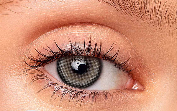
Sterling was the shade that made gray mainstream — cool but not icy, dimensional under any light. Its closest living relative is a blue-leaning smoky gray with radial texture: same cool cast, same "is that natural?" ambiguity at conversation distance.


If you wore Pure Hazel or Honey
The warm family transfers most painlessly, because hazel's magic is in the gold inner ring — and that's a printing feature, not a brand feature. A honey-gold core that blends into your own brown at the pupil is what made Pure Hazel disappear on the eye, and the same construction works identically over dark irises today. If anything, modern warm prints are more forgiving than the original: the gold is layered in dots rather than a solid wash, so it keeps its shimmer under the warm indoor lighting that used to flatten Honey ColorBlends into plain brown. Expect the same "lit from within" warmth, with slightly more texture up close.

If you wore Brown or Chestnut
"Why would anyone wear brown contacts over brown eyes?" — because the right brown doesn't change the color, it cleans it up: brighter, more even, subtly larger. If Brown ColorBlends were your daily lens, you already know this is the most underrated move in the catalog. The pitfall when switching is grabbing a dark solid brown, which just dims the eye; what recreated the ColorBlends effect in our testing is a light caramel three-tone with a defined rim — brightening the iris two steps while the edge keeps everything looking crisp and awake.


If you wore True Sapphire or Blue
Blue is the hardest shade to replace well, because most blue lenses on the market are still printed for light eyes. Over dark brown you need an opaque blue-gray rather than a transparent sapphire — the gray keeps the print anchored to reality while the blue undertone does the talking, which preserves the cool storm-blue effect True Sapphire wearers loved without the flat "painted" look that scared everyone else off blue entirely (full breakdown in our blue-on-brown-eyes review).

Switching checklist
Before the list — one mindset note. Leaving a lens you wore for years feels riskier than it is: your prescription, your routine and your color instincts all carry over. The only genuinely new variable is the print, and that's a one-day test, not a leap of faith.
- Your ColorBlends prescription transfers — power is power. Just re-check the base curve on the product page (most of ours are BC 8.6, same as ColorBlends).
- Buy one pair first, wear it a full day, then stock up. Shade memory from years of an old lens is unreliable.
- Yearly lenses need a case and solution from day one — build the habit before the first wear, not after.
Shade-by-shade: the closest in-stock match, with live prices
These are the nearest designs at the two sizes that read as your own eye, in stock at the time of writing. Prices per pair; one order is two lenses.
| If you wore | Closest in-stock match | Size | Powers | Price | Read as |
|---|---|---|---|---|---|
| Sterling Gray / Gray | Charcoal Gray Contact Lenses with Dark Limbal Ring - Everyday | 14.0mm | plano | $18.98 | a cool light gray with a defined ring |
| Pure Hazel / Honey | New York N Hazel Colored Contact Lenses | 14.0mm | plano | $18.98 | warm hazel, no enlargement |
| Brown / Chestnut | Into The Metaverse X-Brown Flare Colored Contact Lenses | 14.0mm | plano | $18.98 | light warm brown, the lit-from-within effect |
| True Sapphire / Blue | Himalaya Blue Colored Contact Lenses | 14.0mm | plano | $18.98 | an opaque blue that holds on dark brown |
| Green / Gemstone Green | Bright Green Contact Lenses - Defined Rim, Himalaya | 14.0mm | plano | $18.98 | muted green, defined rim |
Judge the match from an on-eye photograph on a dark iris where the product page shows one, not from the flat lens shot. The ColorBlends look was a soft three-tone blend on a light iris; on dark brown the equivalent read comes from a dense print with a fine outer ring, which is what these designs are.
What honestly changes when you switch
A branded monthly lens and a design from this range are not the same product with a different label, and the differences are worth knowing before you order rather than after.
- Replacement cycle. Most of our designs are yearly or longer-cycle lenses; a few are dailies. A yearly lens is cheaper per wear but assumes a real cleaning routine. If you were happy with a monthly precisely because it needed little thought, look at the daily versions first.
- Material. The big brands publish exact material and moisture specifications. We are re-verifying ours against supplier documentation and will not print a figure we cannot trace, so if a specific parameter mattered to your fitting, ask your prescriber before switching and check the product page for what is stated.
- Powers. Our corrective range runs 0.00 to -8.00 in quarter or half steps, with no plus powers and no toric lenses. The prescription collection — almost every design in it powered, $19.98 to $34.98 a pair — is the place to start if you need correction. If your prescription has a meaningful cylinder, a spherical colored lens will not give sharp vision and the honest answer is a clear toric.
- The print. This is the upside. Big-brand naturals are built to blend on light eyes; ours are printed at an opacity built to show on dark brown. If ColorBlends or Colors disappointed on your iris, that is the difference you will notice first.
- Fit. A different brand is a different lens. The diameter line on the product page should match what you were fitted for; if your prescription was written for one brand and you are switching, your prescriber can confirm the parameters transfer.
The cost maths, honestly
A branded monthly worn a few times a week costs the same whether the lens is worn twenty days or four, because the calendar retires it. A yearly lens from this range at $18.98 worn twice a week for a year is a fraction of that per wear — but only if the cleaning routine is real, because the routine is what keeps a year-old lens safe. A daily at around $21.98 a pair is the honest middle: no routine, no case, and a per-wear cost that beats the branded monthly for anyone wearing colour fewer than three or four times a week. Run the numbers against how often you actually wear colour, not how often you intend to.
What the three-tone blend was doing, and what replaces it
The branded naturals built their realism from a three-layer print — a dark outer ring, a mid-tone body and a lighter inner burst — that blended into a light iris. On a dark brown iris the same layers mostly disappear into your own pigment, which is why so many dark-eyed wearers found the branded shades faint. The replacement on a dark base is not a subtler blend; it is a denser one: a print opaque enough to hold its colour to the pupil edge, with the same fine outer ring to keep the iris reading as real. That is what the designs in the table above are, and it is why they photograph as a colour change rather than a tint.
Making the switch without a bad first pair
- Match the size line to what you were fitted for — 14.0mm if your branded lens was a standard natural — before you look at colour.
- Pick the shade from an on-eye photograph on a dark iris, not from the name. Names are set by designers; "gray" and "gray" can be a shade apart.
- Buy one pair, wear it at home in daylight, and check the pupil edge for a halo of your own iris. None means the print is dense enough; a halo means go one step darker or denser.
- Only then buy the season's worth.
Why the shade names will not map one-to-one
ColorBlends shades were named for the blend, not for the result on any particular iris, and the result on dark brown was always a compromise — Sterling Gray on a deep brown eye read as a faint cool haze, not as the steel gray in the marketing photo. So a "closest match" here is a match to what the shade was trying to do, printed at an opacity that actually does it on a dark base. If you loved the exact faintness of the branded lens, the match table will look stronger than you are used to; that is the print holding its colour rather than blending away. Judge it in daylight on your own eye before deciding it is too much.
Prescription transfer, step by step
A ColorBlends prescription is a contact lens prescription with a brand on it. To fill it with a different design: check that it is in date; match the diameter line to the product page; use the power in the selector; and, if the base curve differs from what was fitted, ask your prescriber whether the new parameters transfer — the answer is usually yes for a standard soft lens, but it is their call, not ours. A seller that lets you skip that step is not saving you time; it is skipping the fitting.
Two to start with


FAQ
Is FreshLook ColorBlends really discontinued?
Alcon has been winding the line down by market; many regions and retailers no longer restock it. Whatever remains on shelves is end-of-line inventory, which is why long-time wearers are switching now rather than waiting for a hard cutoff.
What's the closest match to Sterling Gray?
A three-tone blue-leaning gray. Match the structure (dark rim, textured mid-tone, light core) rather than hunting for the exact name — that structure is what your eye remembers as "Sterling."
Are yearly replacements as comfortable as monthly ColorBlends?
Comfort depends on material, moisture specification and fit rather than the replacement cycle. Follow the care routine and the stated schedule, and see your eye care professional if anything feels off — same rules that applied to your monthlies.
Do I need a new prescription to switch brands?
In the U.S. you need a valid contact lens prescription either way, including for plano. If yours is current, you can use the same power values; if it's expired, get it renewed before switching.
Explore more: Gray contacts · Hazel contacts · Brown contacts
Which Mojosee lens is closest to FreshLook ColorBlends Sterling Gray?
A cool light gray with a defined outer ring at 14.0mm — see the match table above for the current in-stock design and live price. Judge from the on-eye photo on a dark iris rather than the flat lens shot.
Can I get a ColorBlends replacement in my prescription?
Yes, in spherical powers from 0.00 to -8.00; there are no plus powers and no toric lenses. The prescription collection is almost entirely powered designs. If your prescription has a meaningful cylinder, a spherical colored lens will not give sharp vision.
You might also like
Picked to match this guide — every pair in stock now.
 Vika Tricolor Blue Colored Contact Lenses$21.98per pair (2 lenses)
 Starry sky Gray Prescription Colored Contact$22.98per pair (2 lenses)
 Polar Lights Brown Prescription Colored Cont$21.98per pair (2 lenses)
 Polar Lights Gray Prescription Colored Conta$21.98per pair (2 lenses)
Explore more: Colored Contacts for Dark Eyes →